Back in 2001, while I was still in midst of a degree that didn’t really teach me anything, I built the first version of roobottom.com on a crappy second-hand PC.
Originally a “Flash playground” (oh, weren’t those the days) I redesigned and repurposed it into a blog around 2005. I’d also started freelancing, launching roodesign around the same time.
That was twelve years ago when I was slightly shorter in the tooth and smaller of belly and working for myself, eventually making the move down south, starting full-time in London. All this rather took up my time and thoughts of a personal web project went the same way as oh-so-many pies.
But a man can dream, and dream I did: first of a CSS3 wonderland with garish colours and effects galore. Then, deciding that blogs were entirely too much hassle, of a stark Neverland consisting purely of some witty paragraph of text and a few links to social networks I hated.
Eventually I went back to basics and fleshed out exactly what I wanted: Somewhere to write the occasional blog post, showcase my work and post my photographs.
Firm foundations
I built my first website because it was fun. I then got a job making websites, again because it was enjoyable. I’m lucky that I get paid for what is essentially a hobby. I think that makes me a “professional” but the jury is still out on that one.
So this site should be the most fun of all, right? I decided to abandon any highfalutin design ideas and just stick to a few core principals that would allow me to grow this site organically.
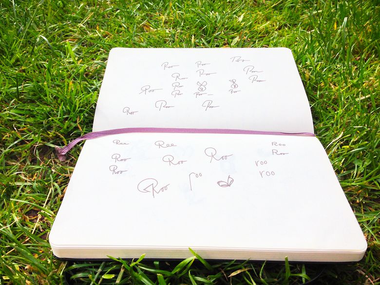
First was the logo. I’d been sketching some ideas around a typographic “roo” for a while. A kangaroo was also an obvious choice. The final result is the emblem you see at the top of this page. Not perfect by any means, but a good starting point. I’ll no doubt change it as the site grows.
Secondly to start with core elements then work out from there. Creating a pleasant and easy-to-use website is key to this idea, but it’s more than that. By letting the content do the work and keeping the design as subtle as possible I’m striving for (but probably rarely achieving) a browsing experience that feels effortless.
I’ve chosen Kirby as my CMS, this has so far proven to be the perfect fit, allowing me to write content in the fantastic iA Writer using Markdown so I always start with uncluttered, unformatted text.
And finally, stop procrastination and just launch the bloody thing! I’ve spent entirely too many late nights debugging css to wait any longer. It’s a personal project that’ll grow. So here it is, warts and all.